I think it’s fair to say that every person knows at least a couple of sayings. Sayings are meant to hold some truth and teach us based on common sense and experience. Be that as it may, not everybody would agree with every single saying since personal experiences have a way of interfering with our perception. There are those sayings though which are agreed upon by most people. One of these is “A picture is worth a thousand words.” And why wouldn’t you agree? Isn’t it based on the way our brain processes information? Can’t information be understood and worked with much faster when processing an image compared to a written or even spoken text? I personally think so.
That is why in project management people tend to visualize complex situations in drawings and charts rather than texts or tables. Don’t get me wrong, a table is fine, especially if you want to dive deep and understand the potential connection between multiple variables. But, as soon as you want to communicate your findings to other people in a more efficient way than forcing them to revise the table themselves, you will need some kind of visualization.
In the AEC industry, usually project and site managers generate insights based on the data they collect from their partners and subcontractors. One of the main questions of running construction projects is: What is the current state on site? Which jobs have been completed and which are running behind schedule? Only answering these questions will allow project managers to do their duty and steer the project to be completed on schedule and budget.
In my experience, visualizations are used in two ways to help answering those questions:
- Subcontractors create coloured drawings (each colour represents a certain state) of floorplans, for example, to communicate their progress made to the management.
- Project managers create similar drawings by manually collecting information from all parties involved in order to use it in progress meetings to easily communicate amongst all parties.
In both cases information about the current progress on site needs to be collected and afterwards visualized by manual, error prone work. We at Sablono think it’s about time to change this!
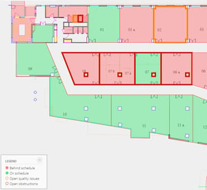
That’s why we’ve created three different 2D visualizations: State, Team and Baseline Comparison. You can basically upload any kind of drawing – floorplans, elevations or even more abstract representations – of your project. Afterwards, Sablono will automatically colour the drawings according to:
- The current state of the deliverables (once again, each colour represents a certain state, just like you are used to).
- The team or subcontractor who is currently – or is tasked with – working on the deliverables (each colour represents a team).
- The planned vs. actual state of the deliverables (green means “deliverable running on schedule”, red “behind schedule”).
And since the visualizations are connected to Sablono’s extensive progress and issue database, you don’t have to manually collect the information yourself anymore. It’s all there and working out of the box. ‘Phone calls’ and ‘manual colouring’ are the PAST. ‘A connected progress database putting data to work for you’ and ‘information accessible to every partner at any given time’ aren’t the future, but the PRESENT.
Join our mission to create a more productive industry!


